

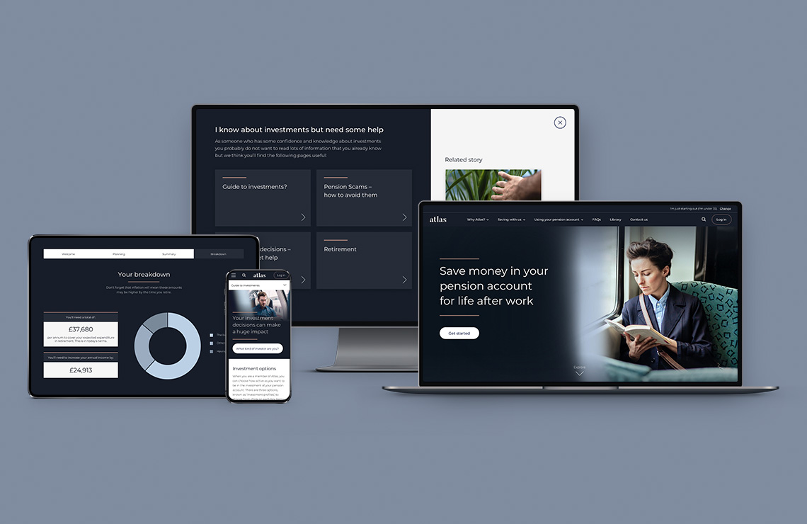

Client: AXA | Company: Capita | Role: Lead UX/UI Designer | Product: Website
AXA Master Trust
AXA was transitioning its pension scheme to a Master Trust and required a new website to communicate this change, providing members with all the essential information.

I conducted a UX review to gather initial insights for the new design. The existing site was outdated, had multiple accessibility issues, and didn't align with the brand.
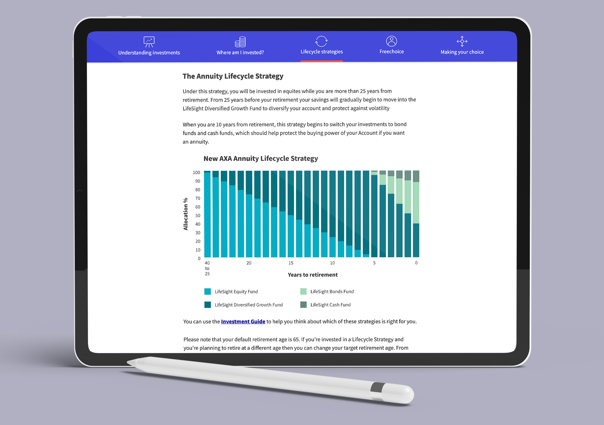
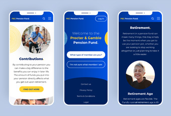
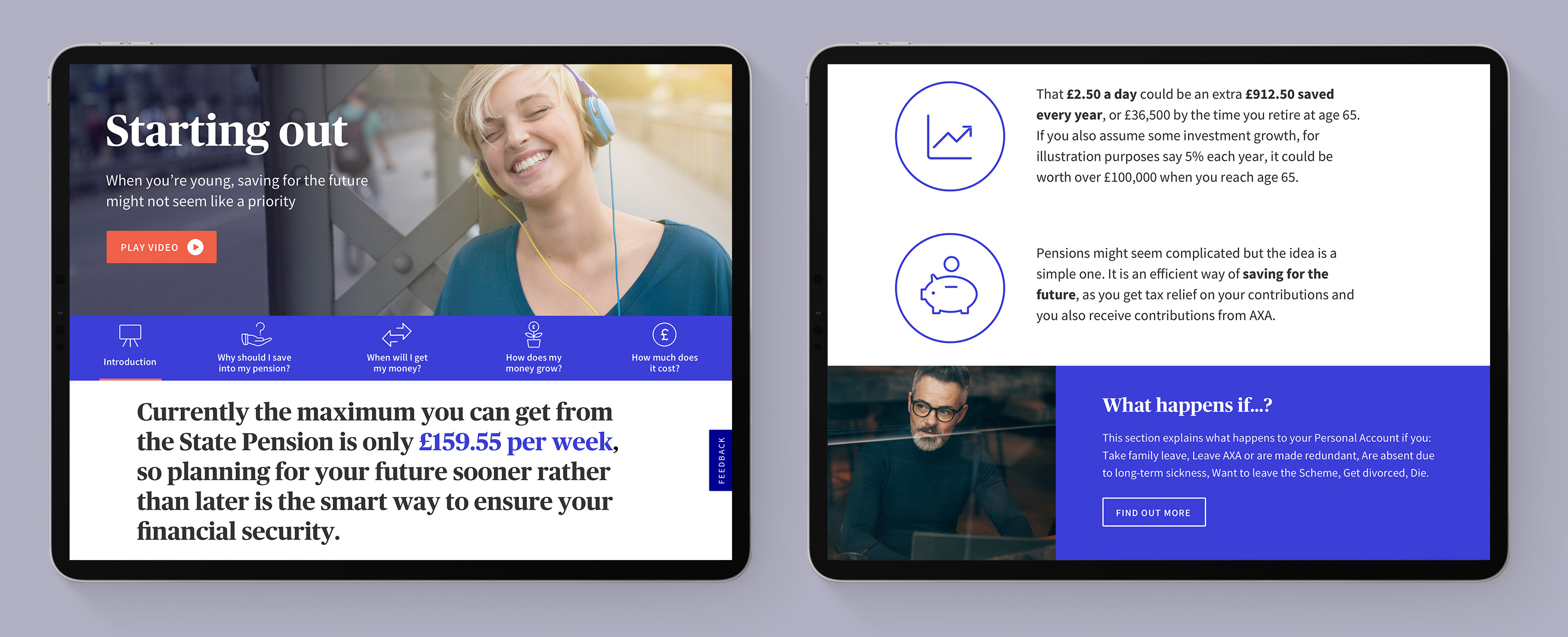
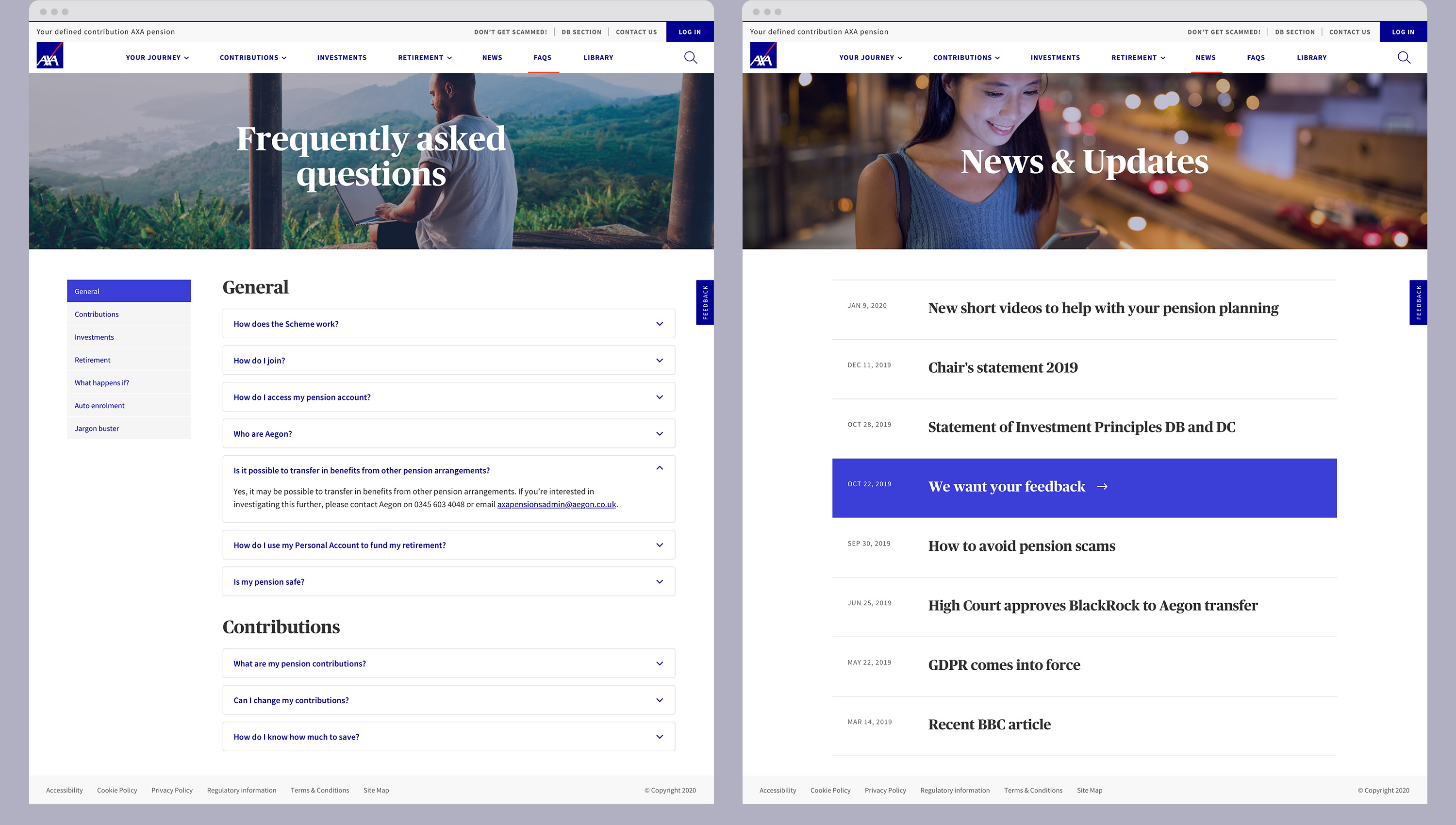
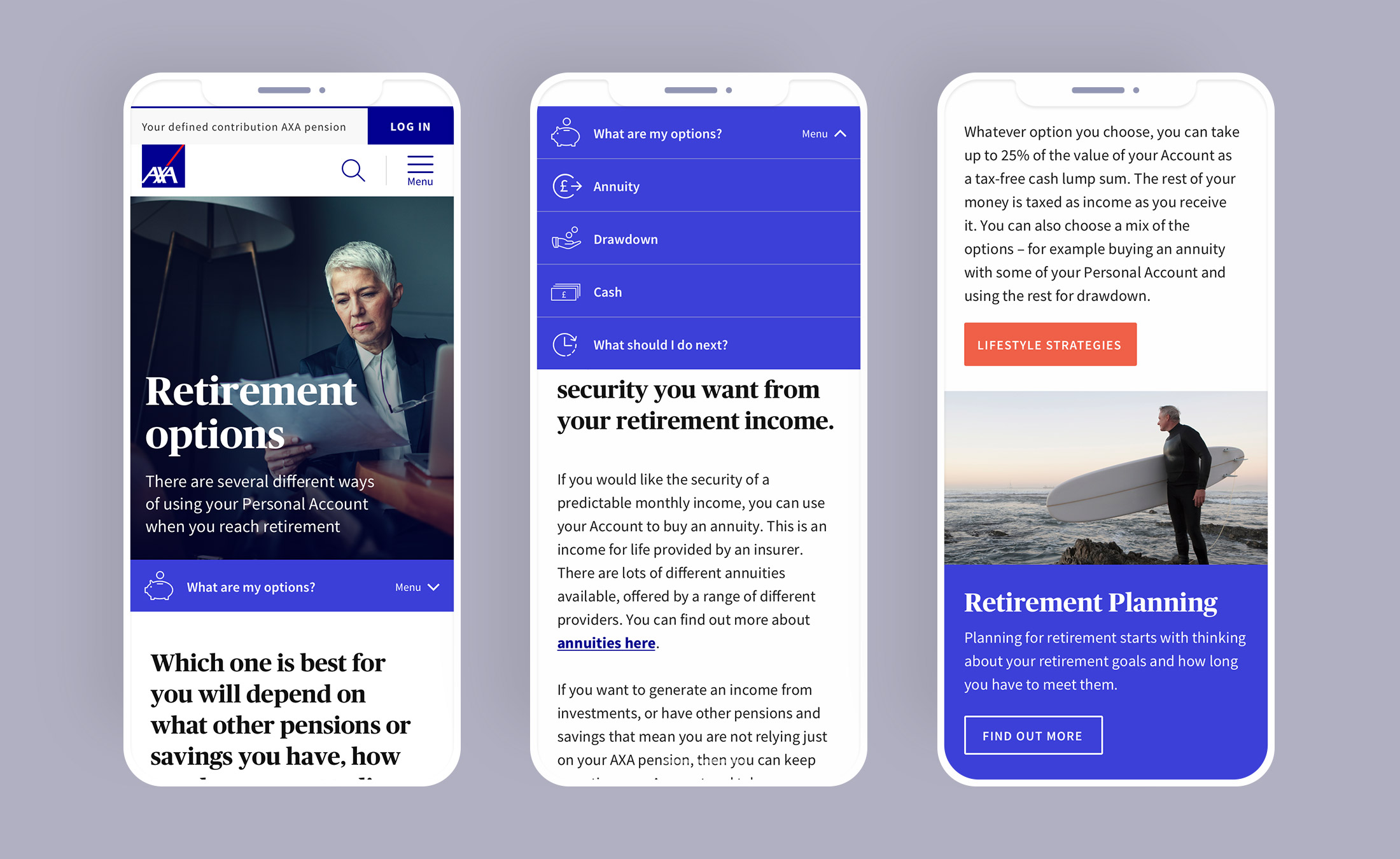
Collaborating closely with AXA, we developed a clear, user-friendly structure that made navigation simple. A central feature of the site was the retirement journey section, personalised by age, where we grouped relevant content to improve user experience.
To make the content more digestible for the members I worked closely with the copywriters to see where we could break down the information into lighter chunks. This informed the wireframes, with a key feature being the use of horizontal tabs, in which users can easily cycle through the content.
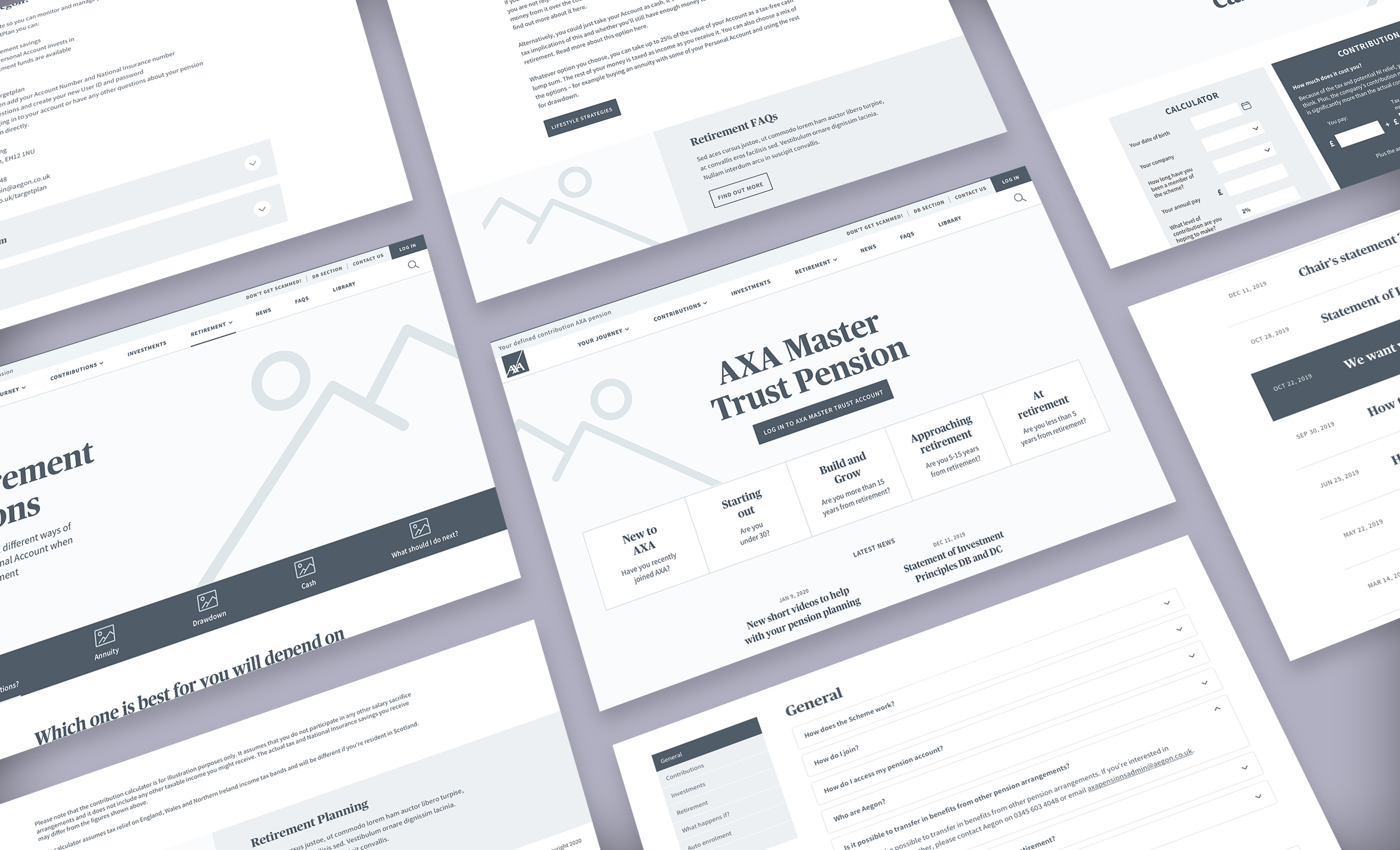
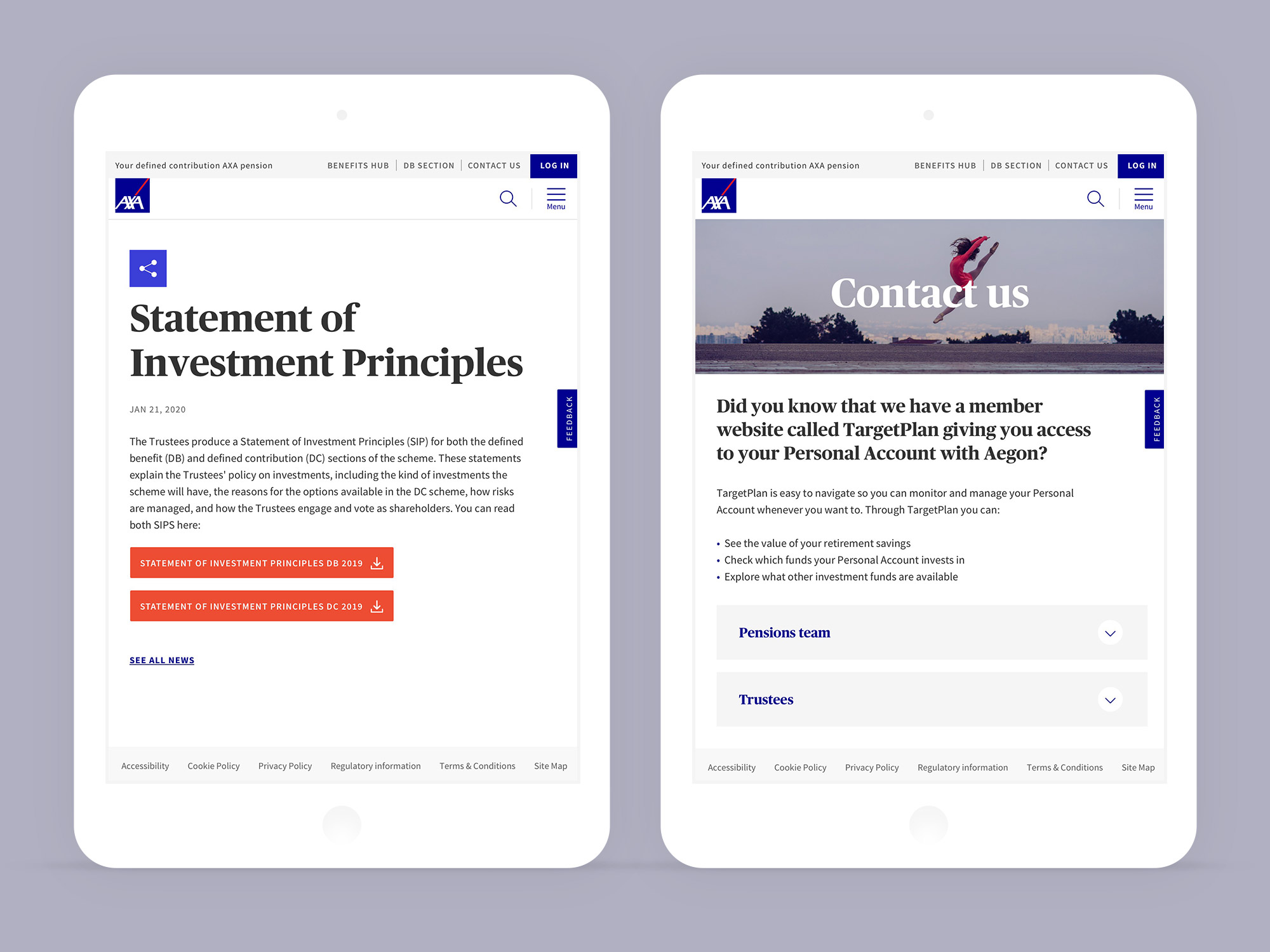
The design has a clear visual hierarchy, with impactful hero imagery, bright sub-tabs with line iconography, bold intro text, and a clean paragraph style. At the bottom of the page, I included a promo spot in which we can lead the user's onto more relevant information.
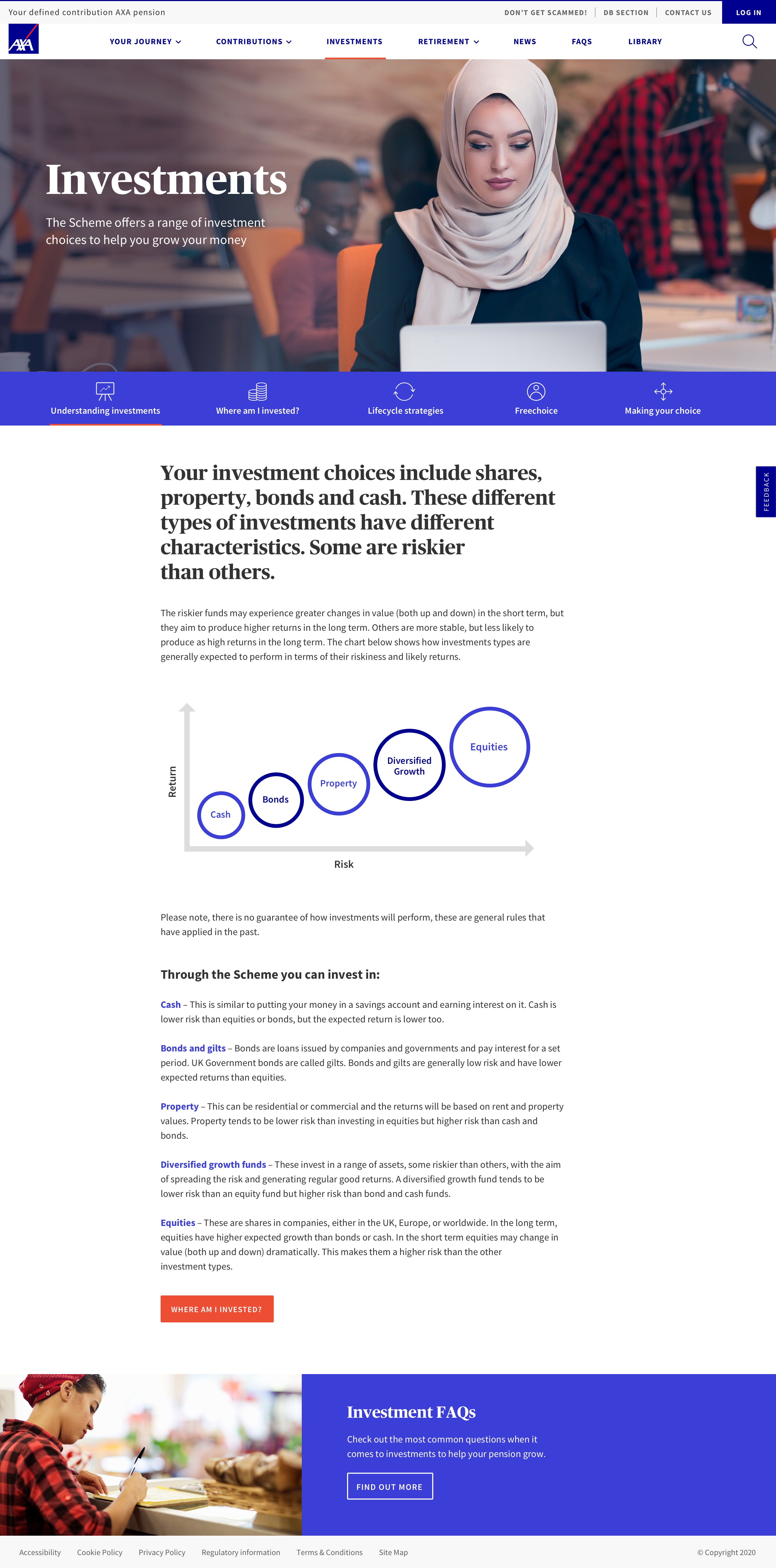
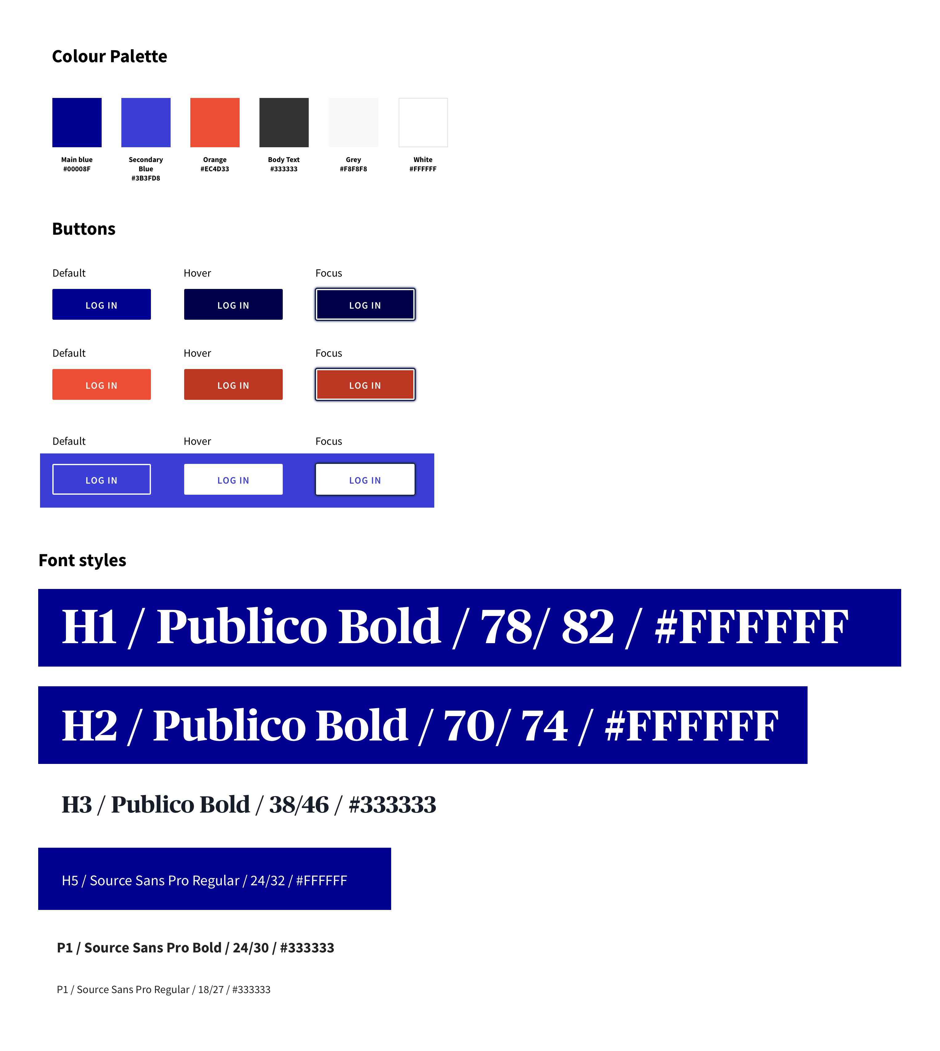
I had access to AXA's online brand hub which was very useful in understanding the visual and tonal style of the company. The aim was to create something fresh whilst still staying on brand. This was reflected in the use of some of AXA's brighter colours from their palette and sourcing imagery that had a real human and emotive level to it.
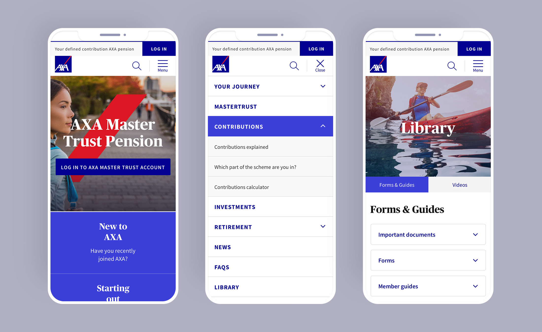
The site responds beautifully across all devices with a clear menu system. I designed an internal sub-navigation which becomes sticky once you scroll down so the user can easily click between content.

The website has been received well by the members, highlighting the ease of use and clear presentation of information. The analytics shows they are now spending more time on the site and visiting more pages than on the previous website.