Client: Atlas | Company: Capita | Role: Lead UX/UI Designer | Product: Website
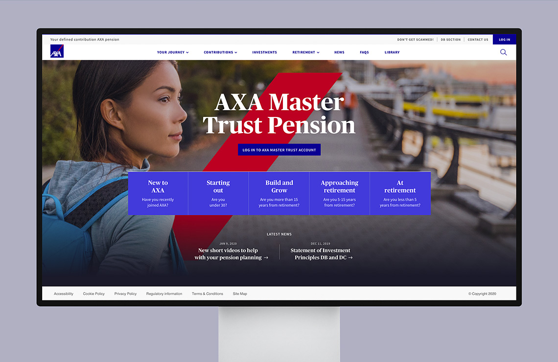
Atlas Mastertrust
Atlas is one of the UK's leading Master Trusts, allowing separate employers to set up individual pension accounts for their employees. Following a recent rebranding, they adopted a more refined and sophisticated approach. To align with this new direction, they required a new website that would serve as a central hub for providing guidance to their employees.
My services
UX/UI
Prototyping
Art direction
We were tasked with applying the brand across a range of communications products, starting with a website to sit in front of their pensions portal. Atlas was keen to delight their members and create an experience that made them feel comfortable and engaged, where they could learn more about their pension as well as accessing useful resources and tools.
The goal was to develop the site in phases with phase 1 ready for the launch date and then make the experience richer over time, including more video content and further tools such as a chatbot.
We took the approach to work very closely with the Atlas team and their members, using workshop sessions to really get to the core of what they wanted from the site and their vision for the future.
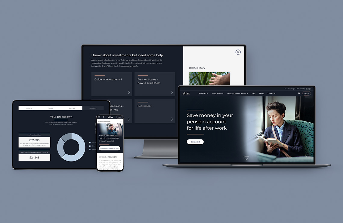
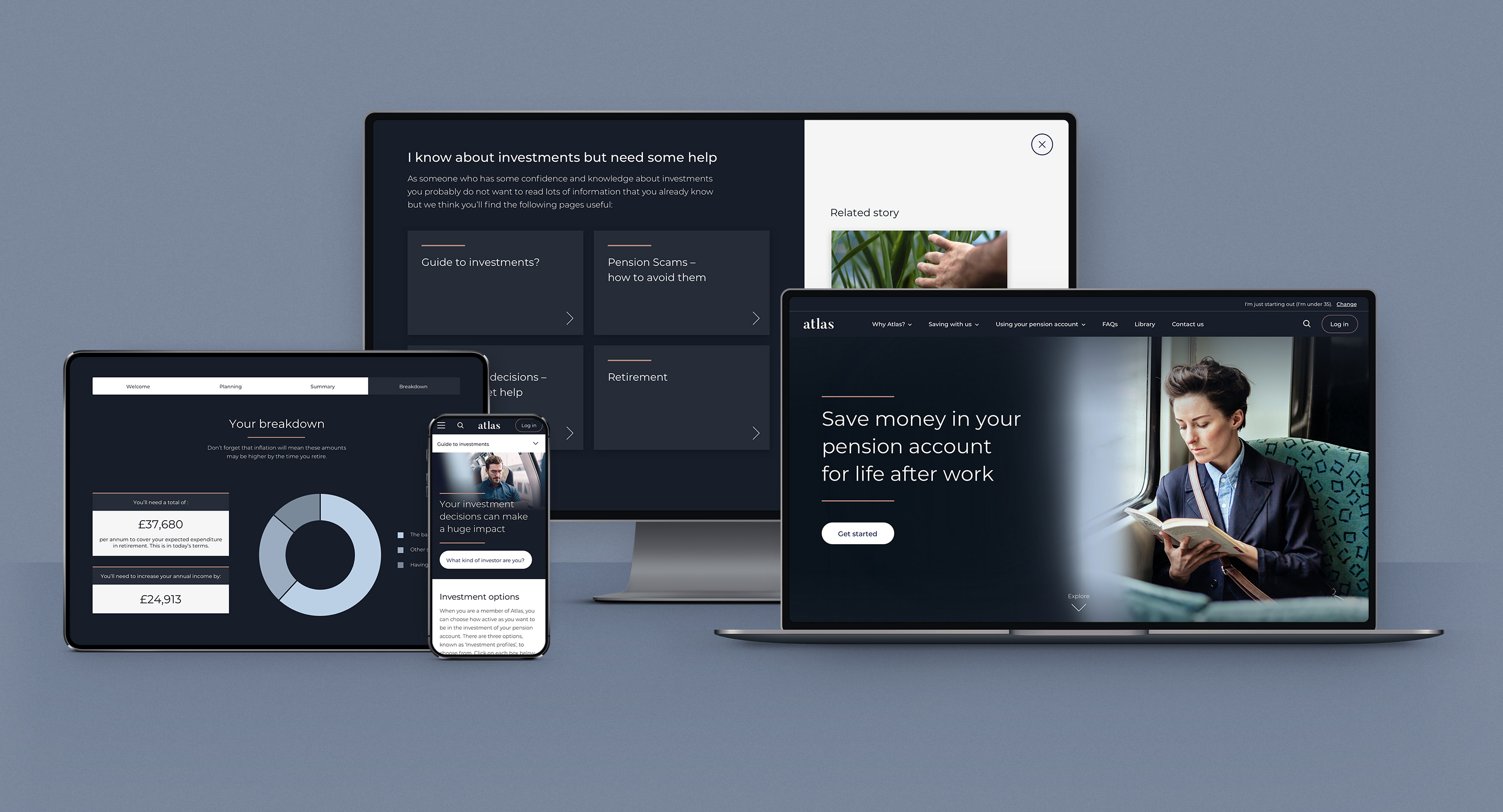
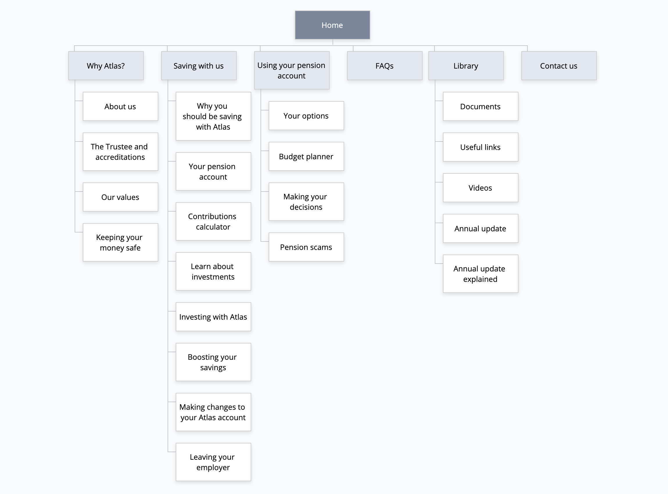
It was apparent that members of varied age groups had different attitudes and views on the information and content that would be of most use to them. Due to this, we decided on segmenting the site by 3 age groups, so we could promote more content-specific information to the members. When I worked on the wireframes this was a key focus by creating modules that could easily be swapped out.
We created an entry page where you select your stage of the retirement journey. This then takes you through to a segmented version of the site. When users are directed from emails to the site, this stage is bypassed as we already know who the member is.
The homepage was designed to be easily updated and act as a great introduction to the site's content. If there is more than one key message they want to promote then we introduce a slider on the main hero area. The module blocks below are where Atlas can promote more age-specific and topical content.

On the subpages, I used jump links on the left-hand side. This was to aid pages where there was lots of content so the user can just select a title and the page anchors down to that section. At the bottom of the page, there are modules of relevant information to keep the user moving through the site.
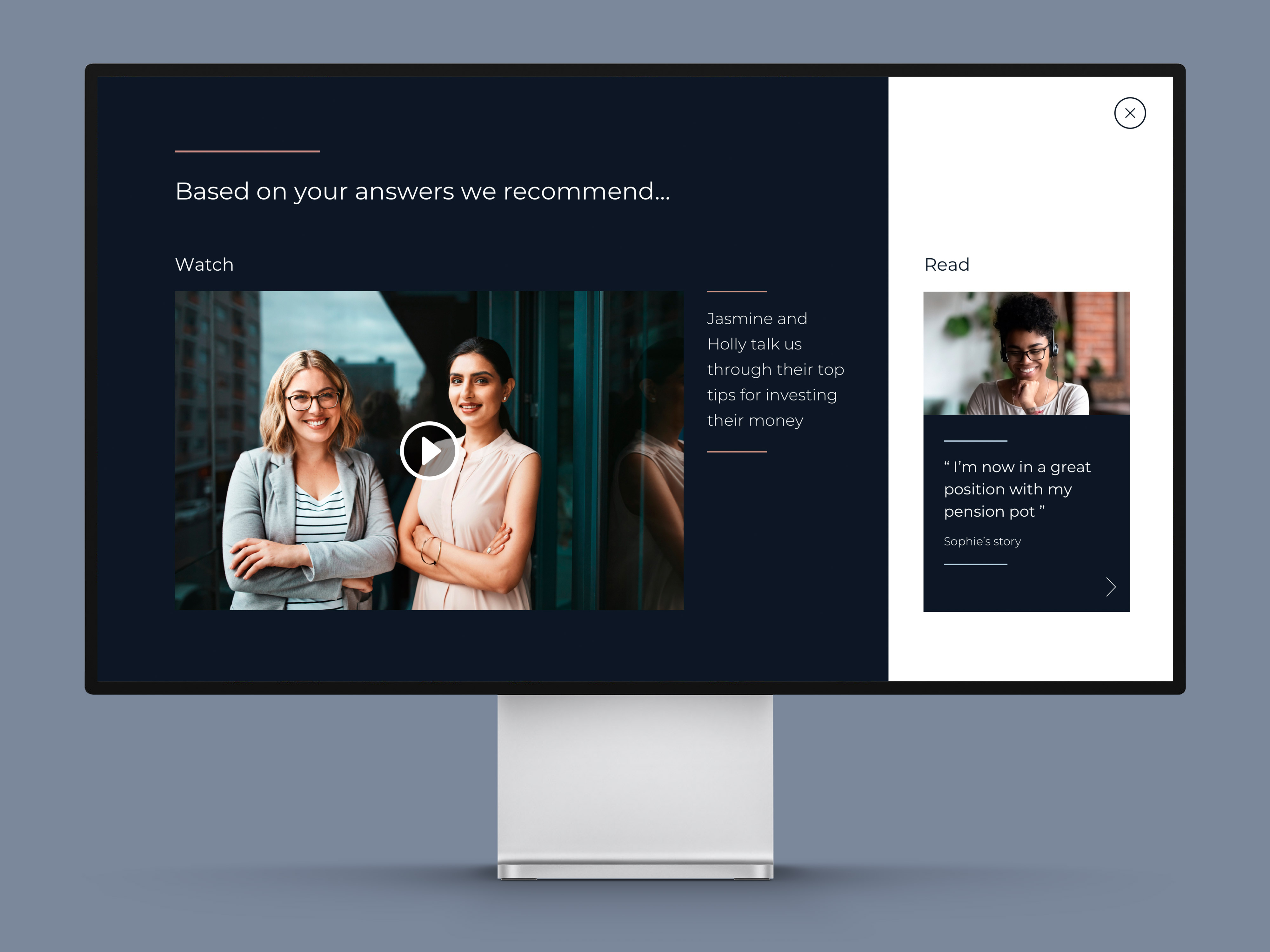
We introduced some key interactive elements which allow different ways for the member to explore the website, discovering content in a more user-led way. The first is in the hero area of the homepage in which they select 'Get started' and are then presented with different areas of the site to explore.
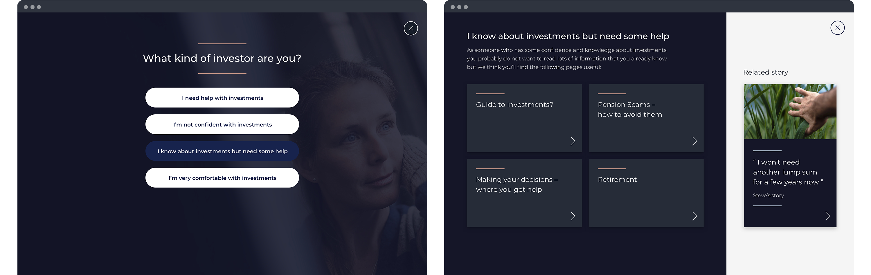
The other feature is around 'what type of investor you are' and depending on your answer you are pointed to various parts of the site that will help you most in your learning.

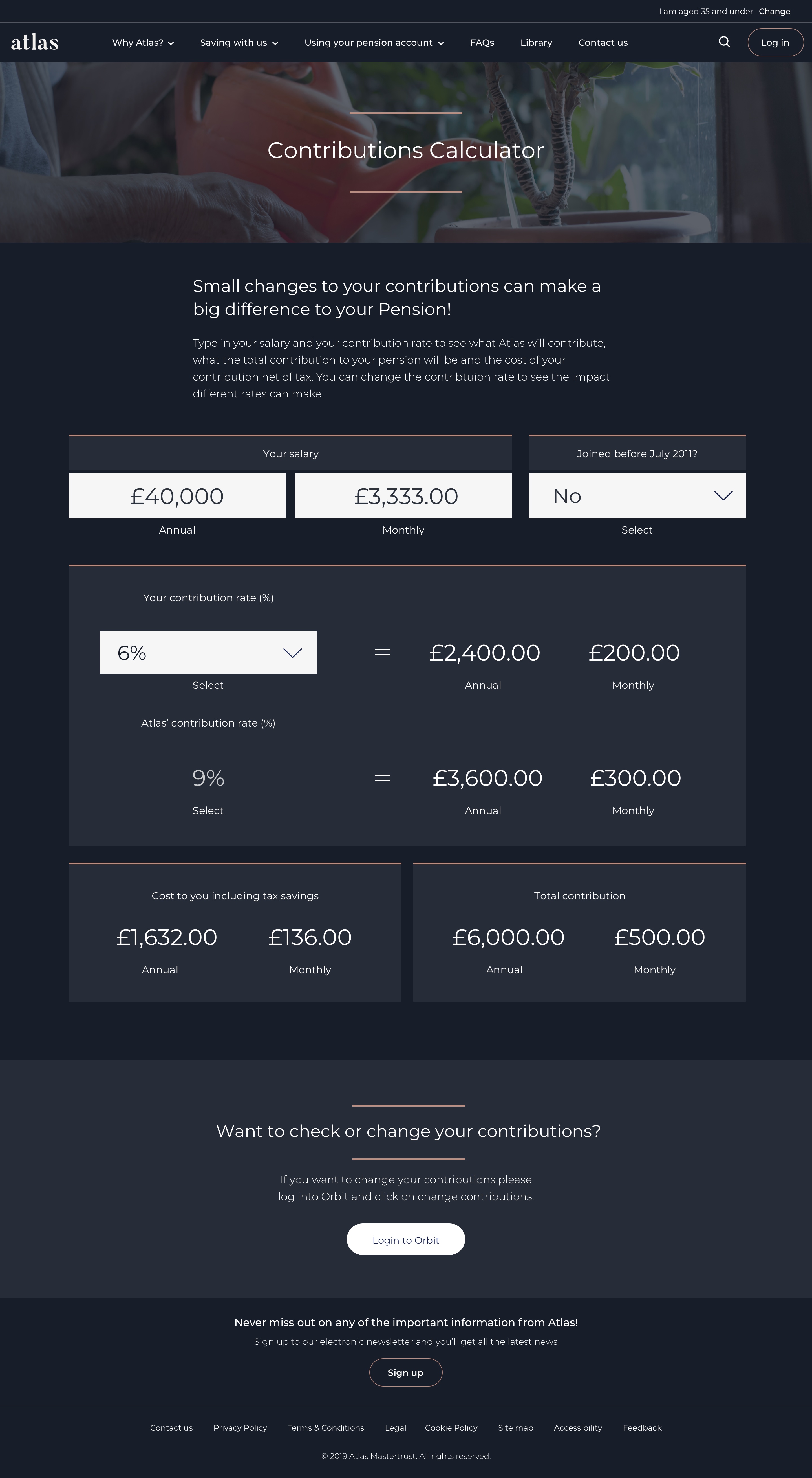
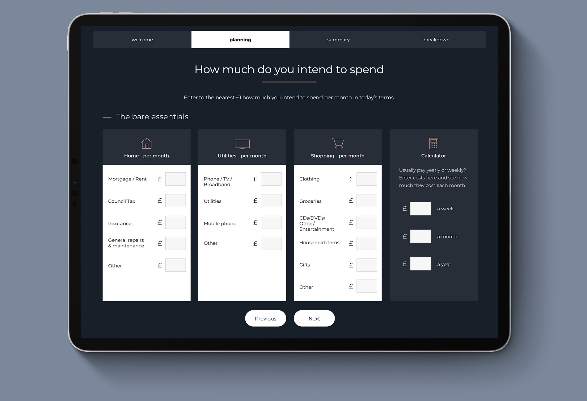
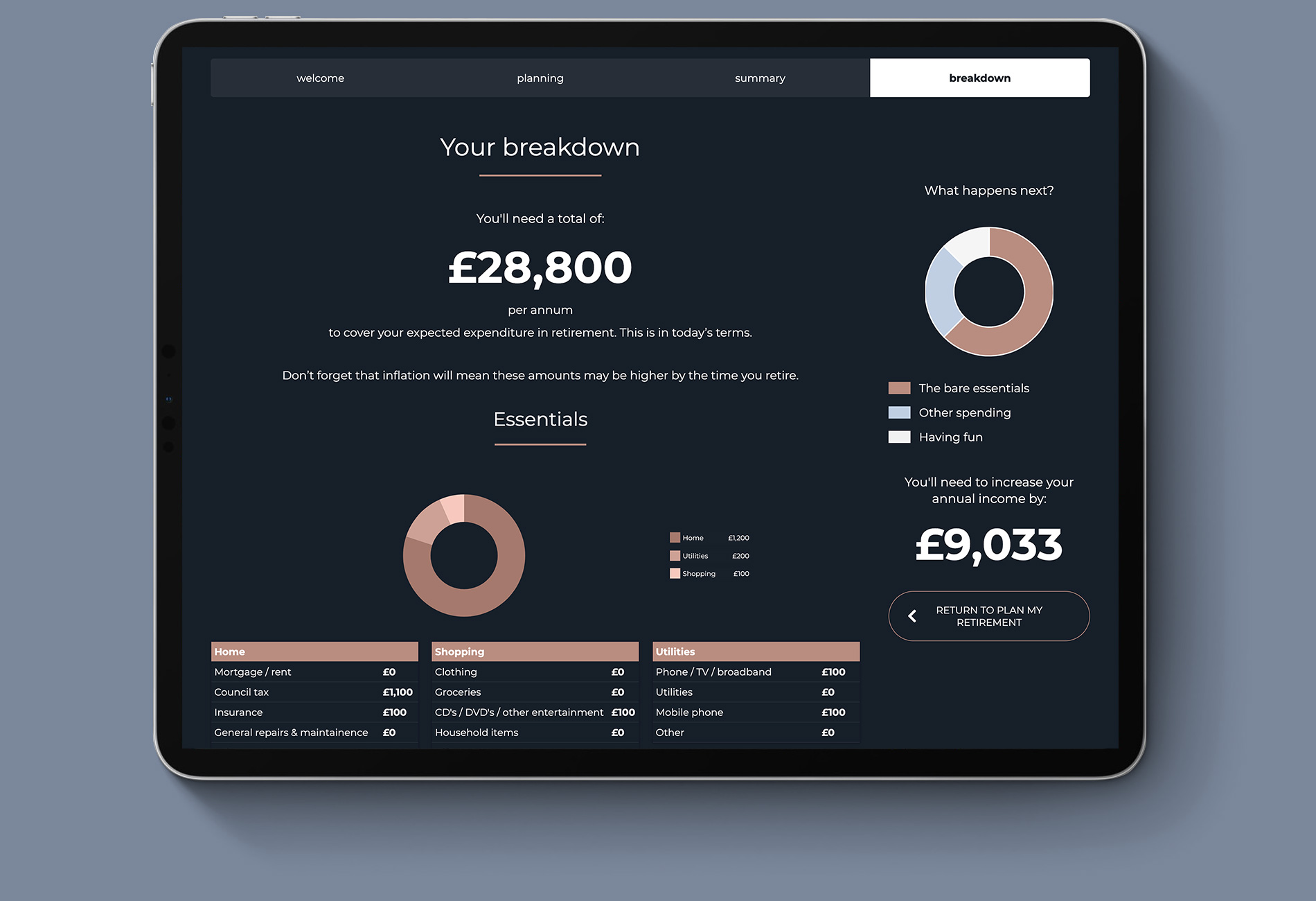
It was key for us to have tools on the website that would be useful for the members. These included a budget planner and a contributions calculator. The aim is to get members to think about their pension in more depth and see how by making some changes to their approach they could end up with a greater pension pot when they retire.
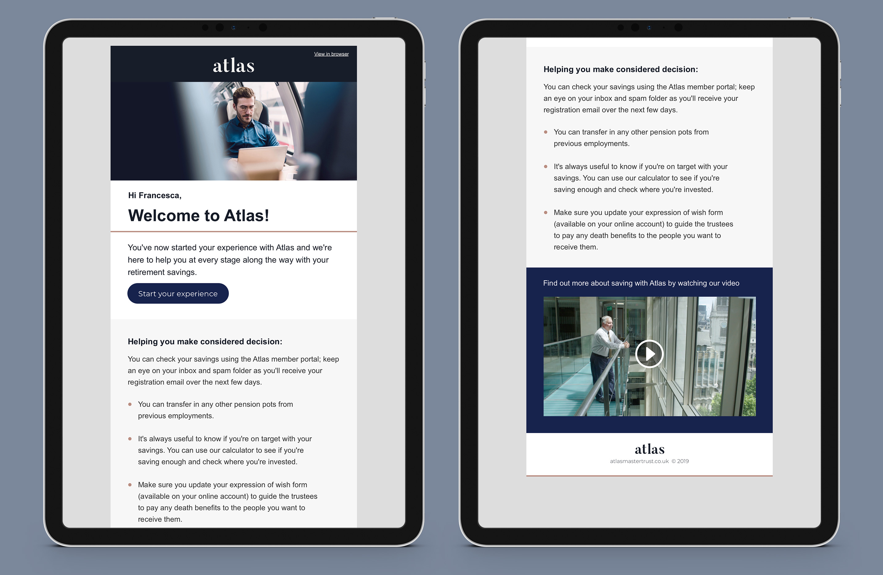
After the site went live I designed a new feature that shows members what communications to expect from when they join the scheme and throughout their career. It highlights materials and information that is available and what to expect to receive during their journey.

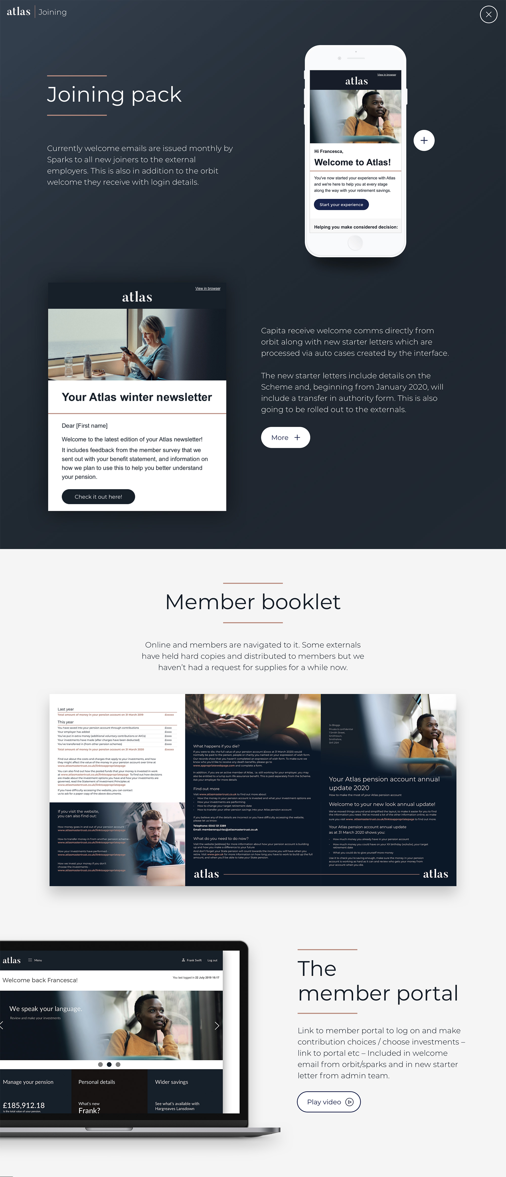
A big part of how Atlas communicates with their member is by email so I designed some templates which could be easily updated. Often Atlas would segment these by age, requiring slightly different content and imagery.
Since its launch, the analytics over the previous 4 months and post 4 months show that we have nearly tripled the number of users, increased page views by over 500%, and turned a 68% bounce rate into a 9% one.
